CSS Cascading 원칙과 Selector
💡 CSS의 Cascading원칙과 Selector에 대해 알아보자.
개요 🛫
이번 포스트에서는 CSS의 기초인 Selector가 핵심이다.
CSS의 꾸미는 요소들을 학습하기 전에 Cascading 원칙과 CSS에 다양한 Selector들을 예제를 통해 알아보는 시간을 가질 것이다.
학습 내용 📖
CSS Cascading
CSS를 적용하기 전에 알아야하는 원칙들이다.
스타일 우선순위
- 동일한 스타일도 선언된 위치에 따라 우선순위가 결정된다.
- 사용자가 구성한 스타일(ex 다크 / 색약모드 / 커스텀 스타일 등) 2. 개발자가 선언한 스타일 3. 브라우저 기본 스타일
- 스타일 적용 범위에 따라 우선순위가 결정된다. (좁을 수록)
- 인라인 스타일 2. id 스타일 3. class 스타일 4. tag 스타일
- 소스 코드의 위치에 따라 우선순위가 결정된다.
- 코드의 순서가 뒤에 있으면 덮어 쓴다. (최종 스타일 적용은 맨 뒤 코드)
스타일 상속
- 부모 요소에 있는 스타일 속성들은 자식 요소로 전달된다.
- 자식 요소에서 재 정의 할 경우, 부모의 스타일을 덮어쓴다.
- 상속이 되지 않는 속성도 있다. ex) width/height margin padding border box-sizing display ....
상속되지 않는 경우(상속받지 않는 요소 또는 상속되지 않는 프로퍼티),
inherit 키워드를 사용하여 명시적으로 상속받게 할 수 있다.
CSS Selector
CSS Selector의 종류를 알아보고 예제를 통해 어떻게 적용되는지 확인해보겠다.
Type/ID/Class Selector
HTML :
<!DOCTYPE html><html lang="en">
<head> <meta charset="UTF-8"> <meta http-equiv="X-UA-Compatible" content="IE=edge"> <meta name="viewport" content="width=device-width, initial-scale=1.0"> <link rel="stylesheet" href="main.css"> <title>CSS Selector</title></head>
<body> <h1 id="welcome-title">Welcome CSS</h1>
<h2>List 1</h2> <ul> <li class="color-blue">TEST LI 1</li> <li>TEST LI 2</li> <li class="color-blue">TEST LI 3</li> </ul>
<h2>List 2</h2> <ol> <li>FIRST</li> <li>SECOND</li> </ol>
<h3>LOREM IPSUM</h3> <p>Lorem ipsum dolor sit amet, </p> <p class="color-blue">consectetur adipisicing elit.</p> <p> Laborum ratione aliquid debitis error blanditiis fugiat quam cumque eos vel, </p> <p>enim commodi deleniti, ea placeat nemo natus nobis provident in? Sit!</p></body>
</html>Type Selector
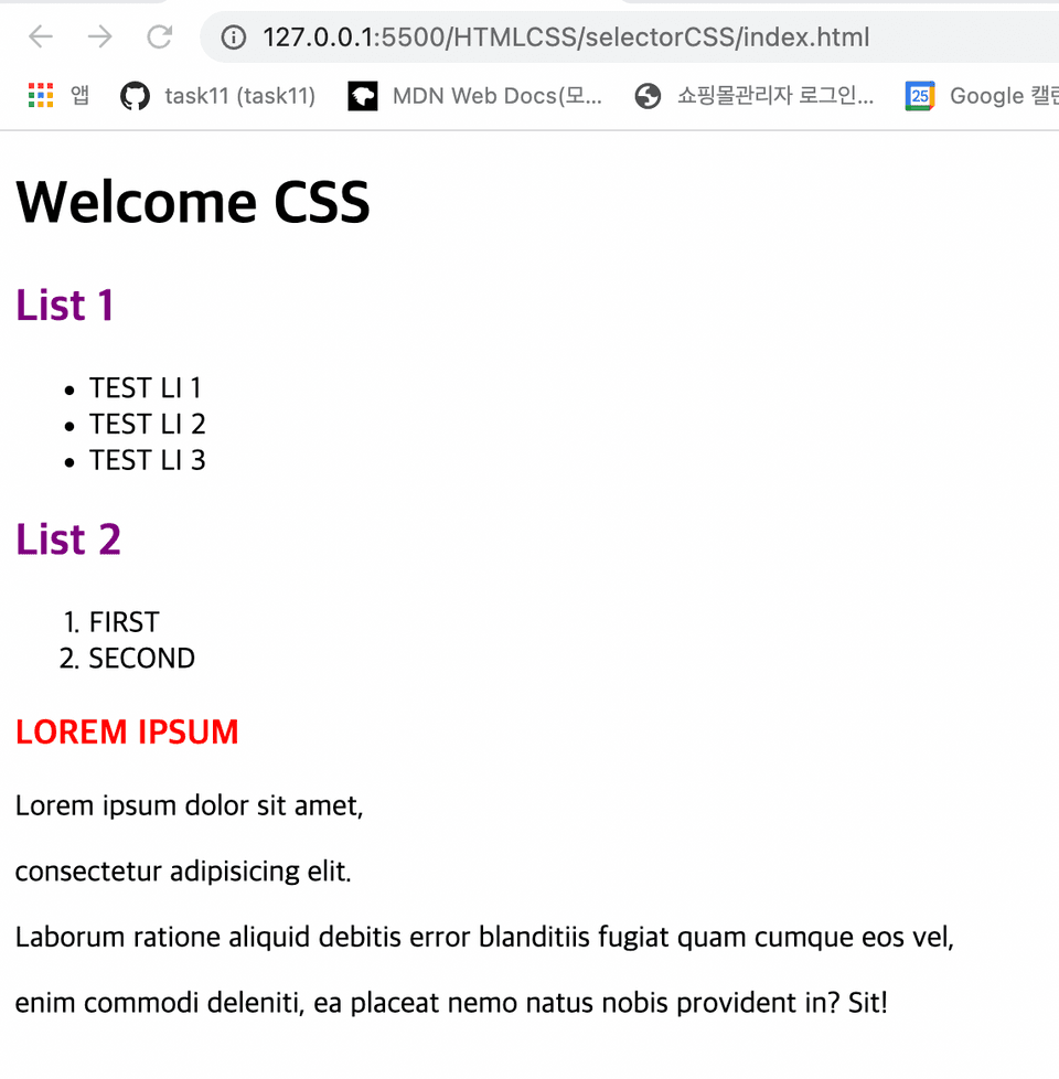
특정 태그 전체에 적용되는 선택자로 사용에 주의가 필요하다.
- 유지보수성이 떨어지므로 특정 내용을 변경할 때 사용을 지양한다.
- 보통 CSS 최상단에 코드를 먼저 작성한다.
**CSS: **
/* Type Selector */h2 { color: purple;}
h3 { color: red;}Result:
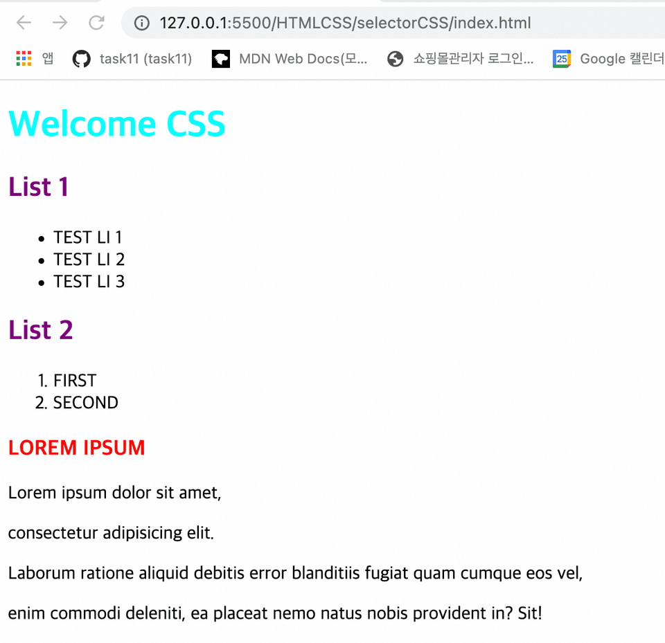
ID Selector
태그에 입력한 id 값에만 적용된다.
- 태그 하나에 하나의 id를 부여해야한다.
- 중복으로 부여할 수 없다.
**CSS: **
/* ID Selector */#welcome-title { color: aqua;}Result:
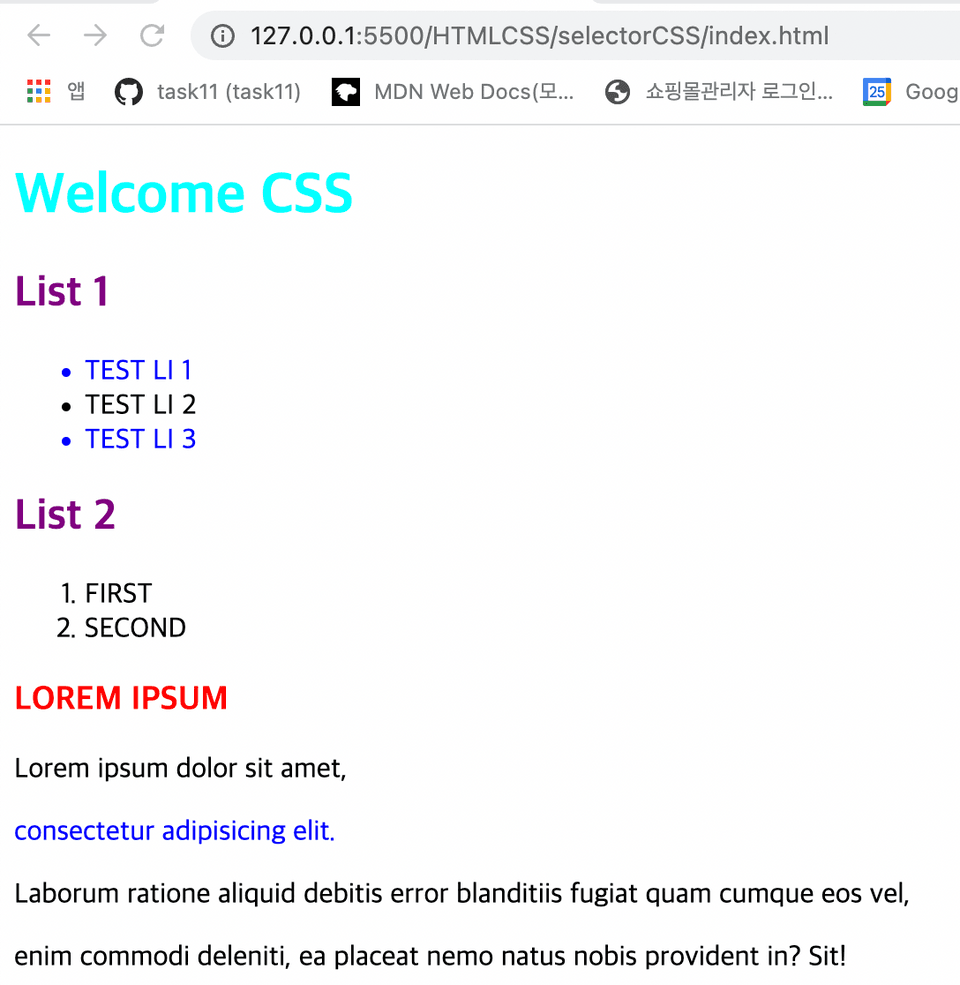
Class Selector
태그에 입력한 class 값들에 적용된다.
- 태그 여러개에 class를 부여할 수 있다.
- 가장 많이 사용되는 CSS 적용 방식이다.
**CSS: **
/* Class Selector */.color-blue { color: blue;}Result:
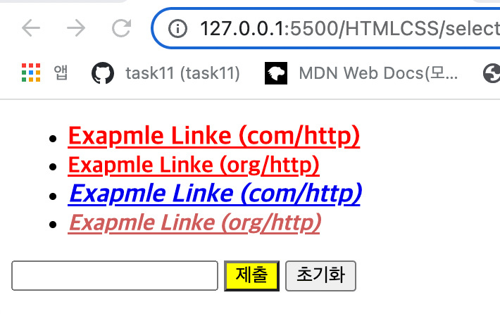
Attribute Selector (속성 선택자)
태그 내부에 속성 값 (Attribute)가 있는 태그들만 스타일을 적용시킨다.
Attribute Selector 적용에는 다섯 가지 방식이 있다.
- [attr] : 속성을 지정해서 통일
- [attr=value] : 속성과 그 값까지 지정해서 통일
- input 태그의 type을 구분해서 스타일을 통일 시킬 때 많이 사용된다.
- [attr^=value] : value 값으로 시작되는 값을 가진 속성들에게 적용
- [attr$=value] : value 값으로 끝나는 값을 가진 속성들에게 적용
- [attr*=value] : value 값을 포함하는 속성들에게 적용
HTML :
<!DOCTYPE html><html lang="en">
<head> <meta charset="UTF-8"> <meta http-equiv="X-UA-Compatible" content="IE=edge"> <meta name="viewport" content="width=device-width, initial-scale=1.0"> <link rel="stylesheet" href="attributeSelector.css"> <title>Attribute Selector</title></head>
<body>
<ul> <li> <a href="http://example.com" target="_blank"> Exapmle Linke (com/http) </a> </li> <li> <a href="http://example.org" target="_blank"> Exapmle Linke (org/http) </a> </li> <li> <a href="https://example.com"> Exapmle Linke (com/http) </a> </li> <li> <a href="https://example.org"> Exapmle Linke (org/http) </a> </li> </ul>
<input type="text"> <input type="submit"> <input type="reset">
</body>
</html>**CSS: **
/* Attribute Selector */
/* 1. [attr] */a[target] { color: red;}
/* 2. [attr=value] */a[href="https://example.org"]{ color: indianred;}
input[type="submit"] { background-color: yellow;}
/* 3. [attr^=value] */a[href^="https://"]{ font-style: italic;}
/* 4. [attr$=value] */a[href$=".com"] { font-size: large;}
/* 5. [attr*=value] */a[href*="example"] { font-weight: bold;}Result:
Pseudo-class Selector (가상 클래스 선택자)
selector로 가져온 요소에서 추가로 범위를 좁힐 수 있는 선택자이다.
-
selector:
first-child: selector로 가져온 요소의 부모 태그 기준으로 첫 번째 요소에만 적용- 부모 태그 아래 첫 번째 요소가 selector에 부합하지 않으면 스타일 적용이 안된다.
-
selector:
last-child: selector로 가져온 요소의 부모 태그 기준으로 마지막 요소에만 적용 -
selector:
nth-child(n): selector로 가져온 요소의 부모 태그 기준으로 n 번째 요소에 적용- n 부분에 함수 입력 가능 ( ex 2n , even, odd )
-
selector:
first-of-type: selector로 가져온 요소 중 첫 번째 태그의 요소에만 적용- selector로 가져온 것이 여러 태그가 같은 클래스인 경우 하나의 태그들은 전부 스타일이 적용된다.
-
selector:
last-of-type: selector로 가져온 요소 중 마지막 태그의 요소에만 적용 -
selector:
nth-of-type(n): selector로 가져온 요소 중 n 번째 태그 요소에 ��적용 -
selector1:
not(selector2): selector1으로 가져온 요소들 중에 selector2로 가져온 요소를 제외하고 적용 -
a:
link: 하이퍼 링크의 상태가 방문하기 이전일 때의 스타일을 적용 -
a:
visited: 하이퍼 링크의 상태가 방문한 이후일 때의 스타일을 적용 -
selector:
hover: selector로 가져온 요소에 마우스를 올리면 스타일이 적용 -
selector:
active: selector로 가져온 요소(버튼 등)의 활성화 시 나타남.- 마우스를 사용하는 경우, "활성"이란 보통 마우스 버튼을 누르는 순간부터 떼는 시점까지를 의미
-
selector:
focus: selector로 가져온 요소(버튼 등)의 양식의 입력 칸 등 포커스를 받은 요소- 보통 사용자가 요소를 클릭 또는 탭하거나, 키보드 Tab 키로 선택했을 때 발동
HTML :
<!DOCTYPE html><html lang="en">
<head> <meta charset="UTF-8"> <meta http-equiv="X-UA-Compatible" content="IE=edge"> <meta name="viewport" content="width=device-width, initial-scale=1.0"> <link rel="stylesheet" href="pseudoClassSelector.css"> <title>Pseudo-class Selector</title></head>
<body>
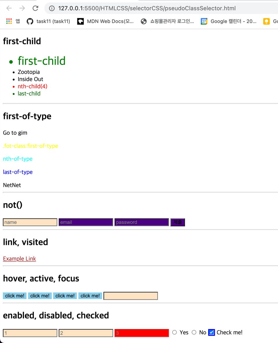
<h2>first-child</h2> <ul> <li class="movie">first-child</li> <li class="movie">Zootopia</li> <li class="movie">Inside Out</li> <li class="movie">nth-child(4)</li> <li class="movie">last-child</li> </ul> <hr /> <h2>first-of-type</h2> <section> <div>Go to gim</div> <p class="fot-class">.fot-class:first-of-type</p> <p>nth-of-type</p> <p>last-of-type</p> <div>NetNet</div> </section> <hr /> <h2>not()</h2> <input type="text" placeholder="name"> <input type="email" placeholder="email"> <input class="passwd" type="password" placeholder="password"> <input type="submit">
<hr /> <h2>link, visited</h2> <a href="http://example.com">Example Link</a>
<hr /> <h2>hover, active, focus</h2> <input type="button" value="click me!"> <input type="button" value="click me!"> <input type="button" value="click me!"> <input type="button" value="click me!"> <input type="text">
<hr /> <h2>enabled, disabled, checked</h2> <input type="text" placeholder="1"> <input type="text" placeholder="2"> <input type="text" placeholder="3" disabled>
<input type="radio" name="my-input" id="yes"> <label for="yes">Yes</label> <input type="radio" name="my-input" id="no"> <label for="no">No</label>
<input type="checkbox" name="check-me" id="check-me"> <label for="check-me">Check me!</label>
</body>
</html>**CSS: **
/* Pseudo-class Selector */
/* 1. first-child */li:first-child { color: green;}
.movie:first-child { font-size: 32px;}
/* 2. last-child */li:last-child { color: darkgreen;}
/* 3. nth-child */li:nth-child(4) { color: red;}
/* 4. first-of-type */.fot-class:first-of-type { color: yellow;}
/* 5. last-of-type */p:last-of-type { color: blue;}
/* 6. nth-of-type */p:nth-of-type(2n) { color: aqua;}
/* 7. not() */input:not([type="text"]) { background-color: indigo;}
/* 8. link */a:link { color: red;}
/* 9. visited */a:visited { color: brown;}
/* 10. hover */input[value="click me!"] { background-color: skyblue; border: none;}
input[value="click me!"]:hover { background-color: teal; color: white;}
/* 11. active */input[value="click me!"]:active { background-color: yellow;}
/* 12. focus */input[type="text"]:focus { background-color: brown;}
/* 13. enabled */input[type="text"]:enabled { background-color: bisque;}
/* 14. disabled */input[type="text"]:disabled { background-color: red;}
/* 15. checked */input[type="radio"]:checked { outline: 3px solid red;}
input[type="checkbox"]:checked { outline: 3px solid blue;}Result:
Pseudo-attribute Selector (가상 요소 선택자)
selector로 가져온 속성에서 추가로 범위를 좁힐 수 있는 선택자이다.
-
selector::
before: 선택한 요소의 앞에 의사 요소를 하나 생성함.- 보통 content 속성과 함께 짝지어, 요소에 장식용 콘텐츠를 추가할 때 사용하며, menu사이에 구분자 등을 넣을 때 사용한다.(의미를 넣지는 않음)
-
selector::
after: 선택한 요소의 뒤에 의사 요소를 하나 생성함.- 보통 content 속성과 함께 짝지어, 요소에 장식용 콘텐츠를 추가할 때 사용하며, menu사이에 구분자 등을 넣을 때 사용한다.(의미를 넣지는 않음)
-
selector::
first-letter: 선택한 요소의 첫 번째 글자의 스타일을 변경해줌before과 함께 사용하게 되면 before에서 지정해준 content 속성 값의 첫 번째 글자의 스타일이 변경됨.
-
selector::
first-line: 선택한 요소의 첫 줄의 스타일을 변경해줌.- 화면크기에 따라 보이는 요소의 양과 상관없이 첫 줄 만 변경된다.
-
selector::
selection: 선택한 요소의 드래그 스타일을 변경해줌.
HTML :
<!DOCTYPE html><html lang="en">
<head> <meta charset="UTF-8"> <meta http-equiv="X-UA-Compatible" content="IE=edge"> <meta name="viewport" content="width=device-width, initial-scale=1.0"> <link rel="stylesheet" href="pseudoElementSelector.css"> <title>Pseudo-element Selector</title></head>
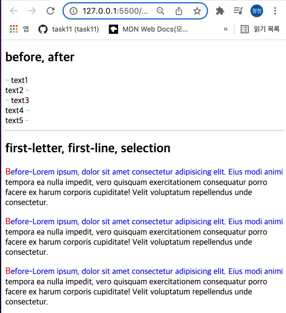
<body> <h2>before, after</h2> <div class="before-after focus"> text1 </div> <div class="before-after"> text2 </div> <div class="before-after focus"> text3 </div> <div class="before-after"> text4 </div> <div class="before-after"> text5 </div> <hr /> <h2>first-letter, first-line, selection</h2> <p class="lorem">Lorem ipsum, dolor sit amet consectetur adipisicing elit. Eius modi animi tempora ea nulla impedit, vero quisquam exercitationem consequatur porro facere ex harum corporis cupiditate! Velit voluptatum repellendus unde consectetur. </p> <p class="lorem">Lorem ipsum, dolor sit amet consectetur adipisicing elit. Eius modi animi tempora ea nulla impedit, vero quisquam exercitationem consequatur porro facere ex harum corporis cupiditate! Velit voluptatum repellendus unde consectetur. </p> <p class="lorem">Lorem ipsum, dolor sit amet consectetur adipisicing elit. Eius modi animi tempora ea nulla impedit, vero quisquam exercitationem consequatur porro facere ex harum corporis cupiditate! Velit voluptatum repellendus unde consectetur. </p>
</body>
</html>CSS :
/* 1. before */.focus::before { content: "-"; color: aqua;}
/* 2. after */.before-after:not(.focus)::after { content: "-"; color: aqua;}
/* 3. first-letter */.lorem::first-letter { font-size: large; color: red;}
.lorem::before { content: "Before-";}
/* 4. first-line */.lorem::first-line { color: blue;}
/* 5. selection */.lorem::selection { background-color: aqua; color: wheat;}Result :
Review 💡
CSS를 적재적소에 효과적으로 사용하기 위해서는 다양한 Selector를 아는게 좋다.
다양한 Selector들의 사용방법을 알면 적재적소에 맞는 퍼블리싱이 가능해진다.